I recently joined Finout, the first FinOps first, self-service cloud observability platform that combines customer business metrics and cost, as Head of Product Design. I was intrigued by the idea of helping customers understand the price of each of their unit metrics, customers, features, and business units. I related to the need to flush out cloud costs, so companies can plan budgets, optimize pricing and gain visibility into finance. In addition, I was excited about being the company’s first product designer and designing the product from scratch.
We started out by releasing a preliminary product version. This version included the basic product layout, and we gradually added more features as we increased our product capabilities.
Once we reached the phase where we had several business partners using and valuing our product, we were able to gather feedback about how they found the design and user experience. Based on that feedback, we set to redesign a number of key elements, to ensure a consistent and valuable user experience.
Our first order of business was to design the navigation bar.
Why Redesign the Navigation Bar?
After listening to our customers, conducting feedback sessions, and analyzing user interactions on our product, the first issue that came up was the top navigation component. Previously, there was only one source of navigation in the data panel application:
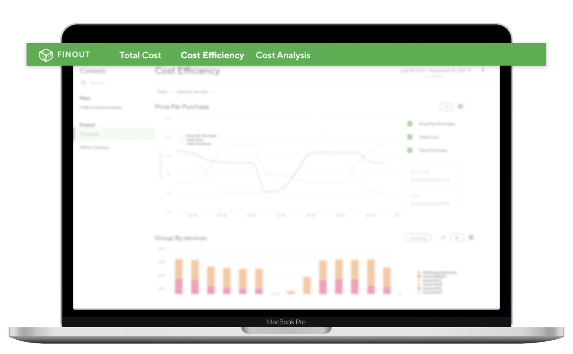
(screenshot of the old app)
This posed some challenges:
1. User Engagement
When a user uses a product and doesn't find what they’re looking for - that's a big problem. By reconstructing the navigation we were able to allow users to easily find what they need and complete their actions.
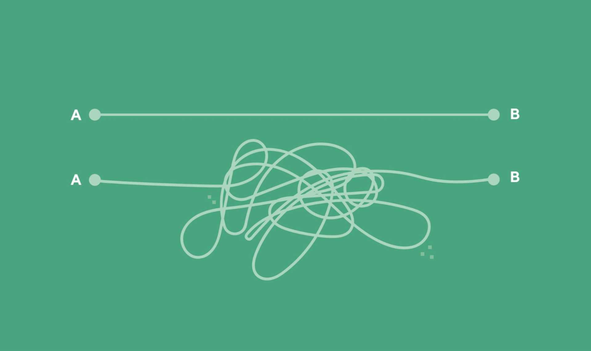
2. Scaling
In a continuously developing product, designers need to provide the flexibility to scale in the UI. The product will grow and add more core pages and utilities, and the product needs to be able to support that, which it couldn’t in the previous design.
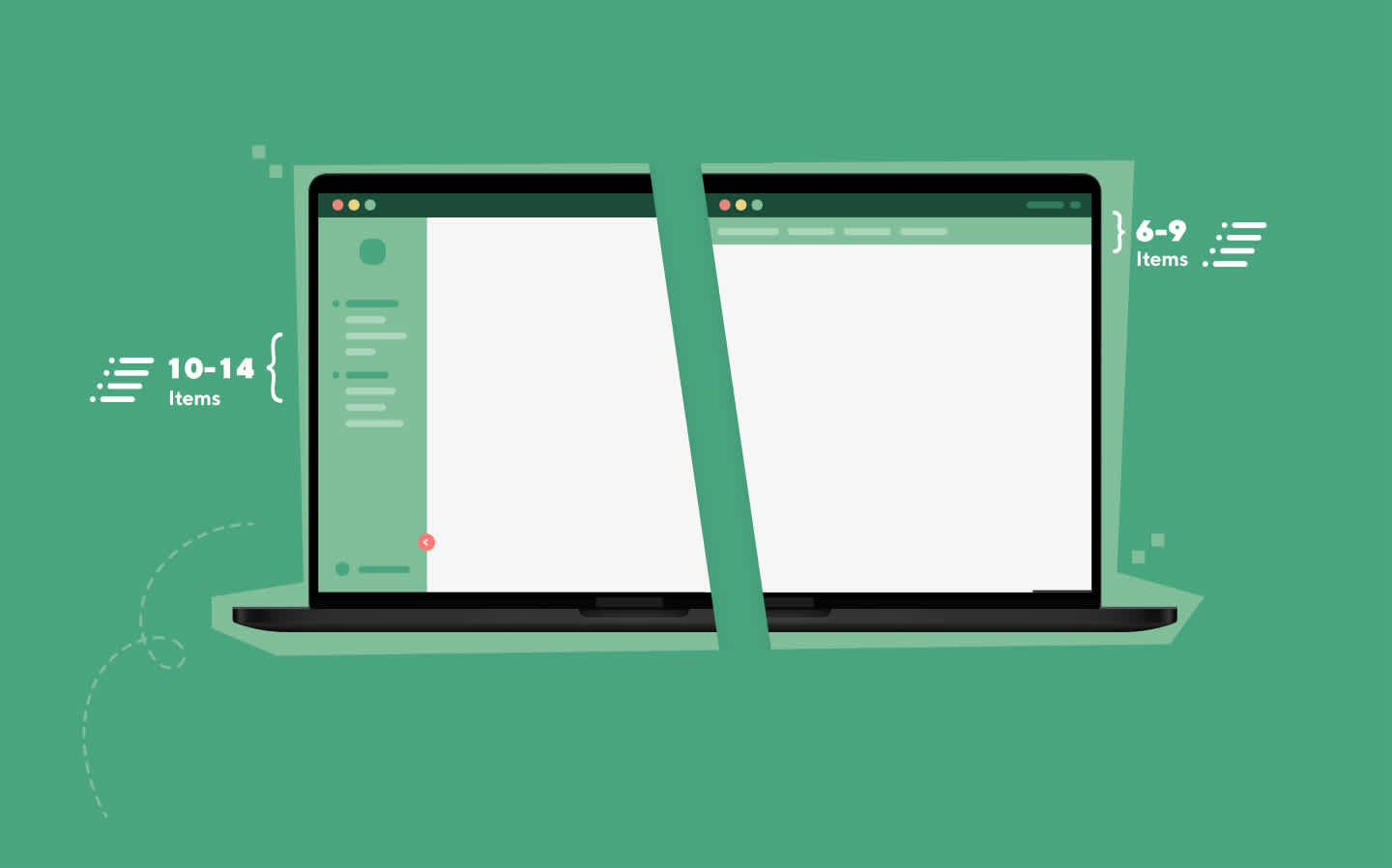
(Side Navigation is easy to scale with more items)
To answer these challenges, we redesigned and updated the navigation bar in two ways: the UX and the visual design.
Our New Information Architecture UX
Our primary focus was to improve global navigation to allow our users an easy way of moving between screens and completing their tasks successfully. We wanted to enable them to navigate between various screens, so they can get the extra layers of business insights that the platform provides.
First, the Total Cost screen displays the dollar amount of their cloud cost. This is the information they’re used to getting, about how high their cloud bill is.
Then, the Business Context screen adds an extra layer of unique Finout. FinOps oriented insights. By integrating with data sources, we slice and dice costs and display the price per unit economics.
Finally, the Cost per Customer screen breaks down the business context and divides the KPIs and unit prices per customer. So our users can finally see how much each of their customers is costing them
To improve this ability, we added a Side navigation as the primary navigation and a Top and sub-navigation as Secondary and Tertiary navigations.
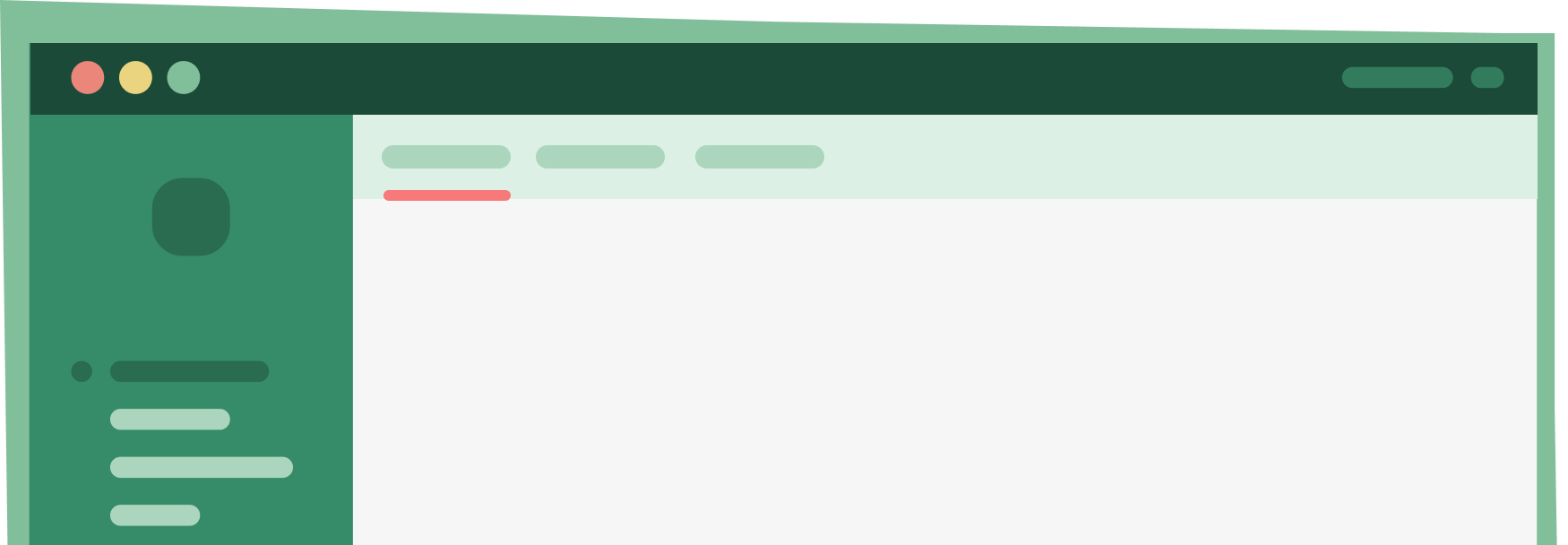
(Illustrations of the navigation )
These new navigation bars now enhance the user experience by enabling:
-
Organization by categories
-
Expanding and collapsing the side-bar
-
States and use cases for each section
Having all of the application utilities separated from our content enabled a more focused experience from our user side. By reorganizing the pages and functionality we allowed the users to focus on their data-related actions.
In addition, it enables us to scale more easily, as the product expands.
Information Architecture Visual Design
When I joined Finout, we started working with a fantastic designer to help us define our brand identity. I’m happy to say we nailed that activity and launched our unique website reflecting our new brand identity. (Stay tuned for a blog post about it!).
For our product, we extracted the brand visual attributes, applied them to our new navigation design:
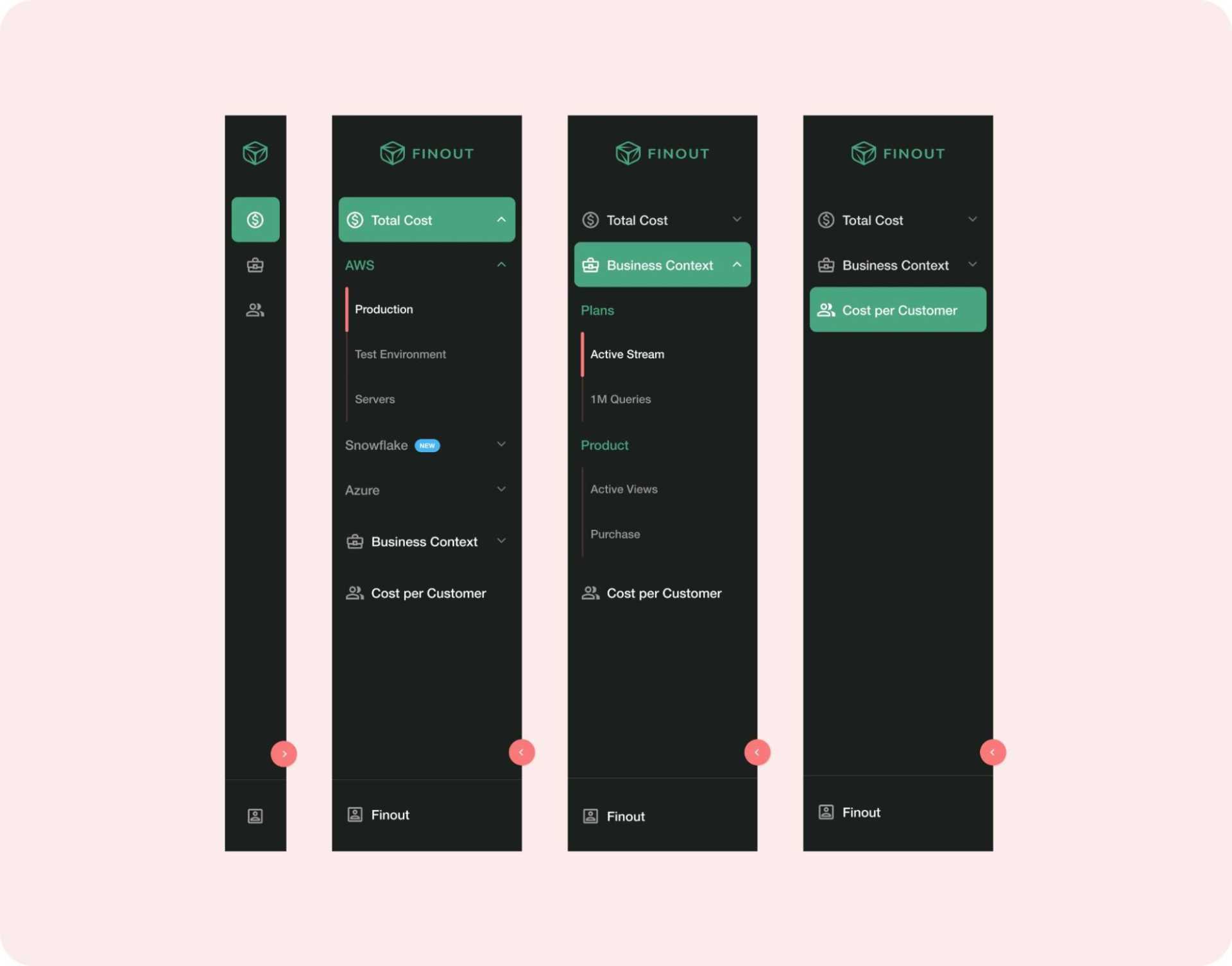
(New design)
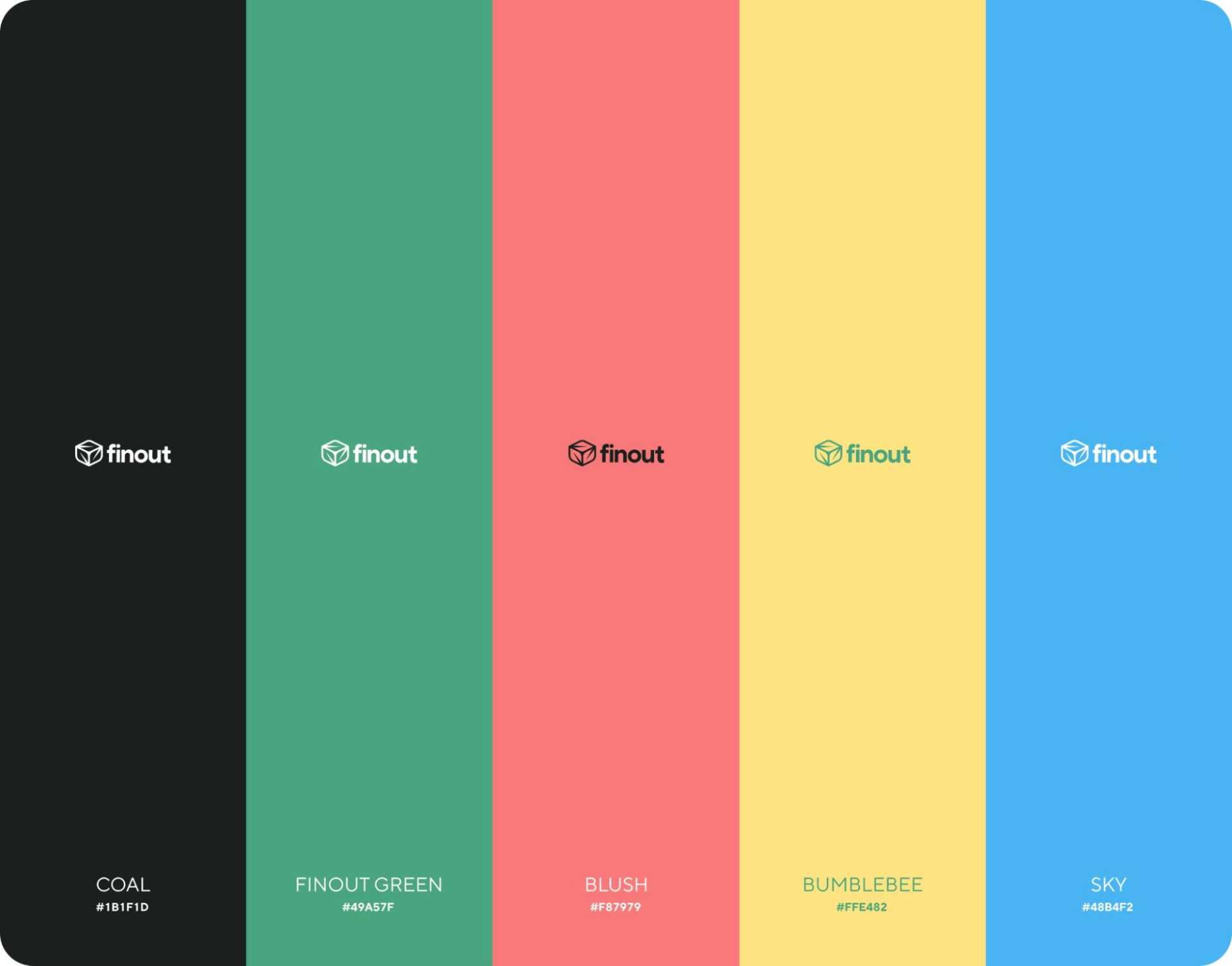
Now, our navigation bar design is aligned with our brand as well.
Release with a Plan
We plan to apply our new design system across the entire platform in phases. Our new navigation release is phase one, and we’re happy to announce there will be more:
What to Expect Next from Finout
We are constantly working on our product and improving the features we offer and the user experience. Feel free to share your feedback with us so we can keep improving.
Besides the new navigation bar, we’ve recently released Kubernetes and Datadog support, which you can read about here. In addition, we’re now offering full support for Snowflake’s cost management, making it easier than ever before to treat costs as a first-class metric and attribute each dollar into its rightful place. Stay tuned!
To see Finout in action, start here.
